Your workplace needs more WOW. Get ready for MHR's World of Work 2026
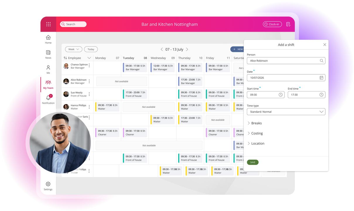
Teams run like clockwork with People First Workforce Management
Trusted by 1,400+ organisations

Focus on what matters
HR, payroll and finance. Bring them together with an AI-enabled platform for sustainable high performance. Unlock frictionless focus that helps get everyone in the zone.
The science behind your best day at work
At MHR we create solutions that help every team member work together as one cohesive unit. Because work shouldn’t be hard work.
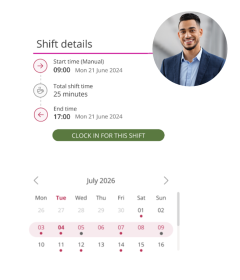
The science behind making work flow
Getting the right people in the right place at the right time, made effortless. Our range of workforce management tools are designed for seamless organisation.
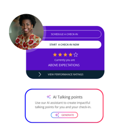
AI that empowers, never replacing
We’ve always been finding new ways to innovate and improve the world of work. From natural language summaries, to supporting check-ins with AI generated talking points, we see AI as a way to enhance, not complicate your work.
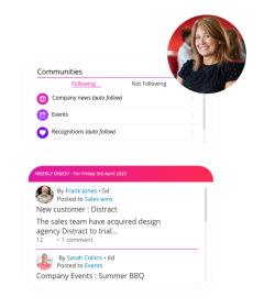
Your most valuable asset, supported, empowered
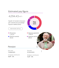
The calculations behind payday done right
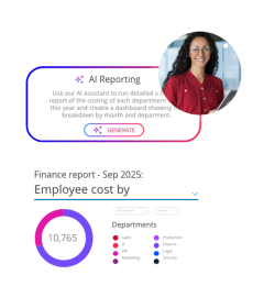
The systems behind data, insights and profit
Data-driven decision making is a lot easier when you have all the data. Finance from MHR gives you a holistic view of your organisation, making financial planning, reporting and analysis a breeze.
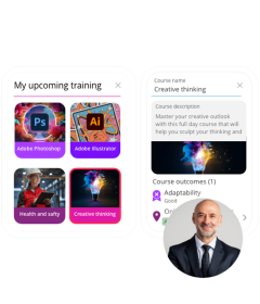
The path to growth, empowerment, high fives
Take your employee experience to the next level. MHR Learning transforms personalised learning paths by giving you the power to create engaging training programs - without increasing the admin burden on your teams.


“MHR was on the journey with us. The engagement, the trust, and the collaboration were there throughout.”


“People First has really helped us to streamline our processes and save us time as a department.”


“The learning platform on People First has been a massive benefit for our L&D team. For the employees themselves, they can access 55+ courses. From there we can sit down with their managers and work out development plans.”


“I was made to feel so welcome by MHR colleagues and representatives, a great foundation for building successful relationships.”


Discover MHR
-
What we offer
-
We create market-leading HR, payroll and finance software that unlocks a seamless, sustainable, focused world of work. Automate key processes and maximise your impact on your industry.
-
What we do
-
Start your MHR journey now by learning about People First, our market-leading cloud-based software.
-
Who we help
-
It doesn’t matter the size of your organisation or the industry you call home. We’ve got the skills and expertise to help you grow sustainably.
The science behind the new world of work
Let's talk
Book a demo of one of our world leading software solutions
